The way we measure effects in the social sciences may be way more important than what you think…

This post is for a broad academic readership
The mystery of the top earners
Just yesterday I came across this post from the NeuroNeurotic blog. The idea is very interesting as it discusses how some “psychological effects” may actually not be psychological at all. Instead, the effect may appear just from some data manipulation (aka an artefact).
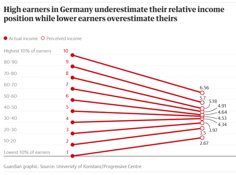
The blog’s post takes a look at this other article from the Guardian. Here a study shows how the top earners in Germany believe their earnings are almost the average ones. This claim is someway supported by this pretty cool visualization:
On the left, people are divided in deciles. For example, the maximum decile (i.e. 10) would be the top 10% earners. On the right, we have some kind of perceived income. (More details later!)
The problem we now face is: are we sure this picture is telling the truth? Which can be reformulated in: “do we really need some psychological effect to obtain this graph? Or can it be obtained just from data manipulation?”
NeuroNeurotic’s solution
According to the NeuroNeurotic blog, the previous image does not really support the claim. Indeed, it may just be an artefact due to binning.
For those who do not know yet this binning guy, he is just the cousin of rounding. Indeed, when we round, we take a lot of numbers and collapse them into fewer groups. For example, all the numbers from 1.5 to 2.499 will be grouped into the number 2.
Similarly, we may take person 1 to 1,000 and put all of them into the same bin/group. Thus, deciles are a way to group people into 10 bins.

The main idea behind the blog’s argument is that binning is putting in the same group people that, maybe, should not be together. For example, the top decile will contain people which may have gigantic differences in earnings. Thus, averaging these values together will bring them closer to the mean value.
For a more detailed explanation, you may look at the original post. However, what I found extremely interesting is how the author was able to reproduce a similar image in simulations even without any psychological effect!
Indeed, he assumed that the distribution of earnings followed a normal (aka Gaussian) distribution. Then, he assumed that every person is just answering their real earning and collected the average value per decile. The striking result is the image below.

My question this time is: is the simulation really reproducing the results from the article? Which can also be restated as: “is it just a matter of binning?”
The surprising effect of binning
Let us try to simulate something slightly different now. Earnings are still normally distributed like before, and people are still divided into deciles (i.e. binned). However, this time we ask people: “in which decile of the population do you think you are?“
This means that in the previous simulation everyone was answering her own earnings. Now, everyone will answer her own decile. Similarly to the previous simulation, also here everyone is answering correctly (i.e. no errors or effects).
The interesting fact is that if we run this simulation, we obtain the following image. Why? In this case we still have binning but the result disappeared!
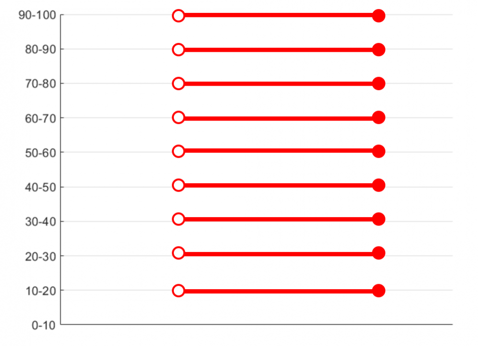
The short answer is that everyone is just answering her own decile. So all the people in the 10th decile are answering 10 and the mean value would still be 10.
The longer answer is that we are actually facing a problem of measurement…
A problem of measurement
What was not really clear here is that we are currently dealing with two different scales of income. The first scale is just the earnings and it is measured in dollars. Meaning that if I earn 1,000 $ and you earn 5,000 $, the difference between us would be 4,000 $.
However, there is also a second hidden scale: ranking. In this scale, each person receives a score (aka number) according to how they place. For example, the poorest person would be number 1, the second-poorest would be number 2, etc.
To understand why this difference is important let us take the two poorest people in the simulation. Let us say one has 1 cent and the other has 5 cents. Thus, their difference in dollars would be 4 cents. However, their difference on the ranking scale would be 1.
This difference of 1 would also be the difference between the two richest. However, their difference in dollars may be of some millions or even billions.
This tells us that the relationship between the two scales is someway weird. This “weirdness” is called “non-linearity” in mathematical terms, but let us stay away from obscure mathematical concepts.
Instead, let us plot the relationship between the ranking and the dollar scale. Does it look someway similar to something else? Notice how most of the lines are again tilted towards the center!

What we just observed is the fact that when we change scale we produce some distortions on the graph. This may result in compression (e.g. all the lines going towards the centre) or expansion depending on the two scales.
Furthermore, if we bring back our old friend Mr. binning, we will be back to our initial effect. As you see, for example, the top line is not horizontal anymore as it has been averaged with the other top 10% lines.

So what?
Our analysis shows us some little interesting facts:
- Binning alone is not sufficient to produce the effect in the article. Indeed, it would result in straight horizontal lines.
- Scale transformation is a beautiful way to create a mess. Indeed, the relationship between the two scales would look like a mishmash of tilted lines.
- Scale transformation + binning is the ultimate key for a disaster. One creates a mess while the other averages it out partially. This creates a cool relationship between the two scales which may be confused for an effect.
Then, is the study wrong?
The short answer is: “we don’t know.” Actually, everything depends on the question that was asked to participants.
If the authors asked “what decile do you think you belong to?” then everything is fine. Indeed, the two scales would be decile VS perceived decile. Here we have no scale change and binning alone cannot do anything to explain this.
For example, the study showed that the top decile answered an average of 6.5. This means that, roughly, people in the top 10% think they are only in the top 40% and that there are still 30% of people richer than them. This bias is definitely an interesting psychological effect!
However, what if they asked something that made people think in terms of earnings instead of ranking? In that case, the plot would be affected by scale transformation. Indeed, the first column would be a ranking while the second would be an earning scale! Thus, we would have all the ugly effects we discussed before.
For example, we may ask “on a scale 1 to 100 how does your earning compare to the richest person? With 100 being the same earning as the top one, 50 being half of it and 1 being 1/100 of it.“
Let us suppose the richest person earns 1 million and the second richest earns 0.7 millions. Even without any psychological effects, person one will answer 100 and the second will answer 70. Thus, the line of the top earners would not be horizontal but tilted towards 50!
In conclusion
Always be careful of how you measure things, especially in the social sciences. Indeed, changes of measurement have the potential of messing things pretty badly.
Next time we will discuss about another effect that may be present in this study!
Until then, let’s stay rational!
Related topics: