During these days of quarantine, a hard task is to keep people informed. The main problem comes with the nature of the data that are usually misleading. Indeed, while people can easily understand the concept of new cases or number of deceased, these values are not representative of the real growth. Indeed, the number of cases has a clear exponential growth.
A solution is using the growth rate, as many are doing now. Unfortunately, this is a quite abstract concept and most people do not have any idea of how big a rate of 30% actually is. And even if we say that this rate decreased by 80% they still have no clue how good this is.
With Social Complexity Labs we decided instead to use a more understandable measurement: the doubling time. That is the time needed for doubling the number of cases at that specific rate. We express it in days and months, so people can directly quantify the increase.
Furthermore, we are also working on making the graphs aesthetically pleasing. (All of this is part of our project on better scientific communication).
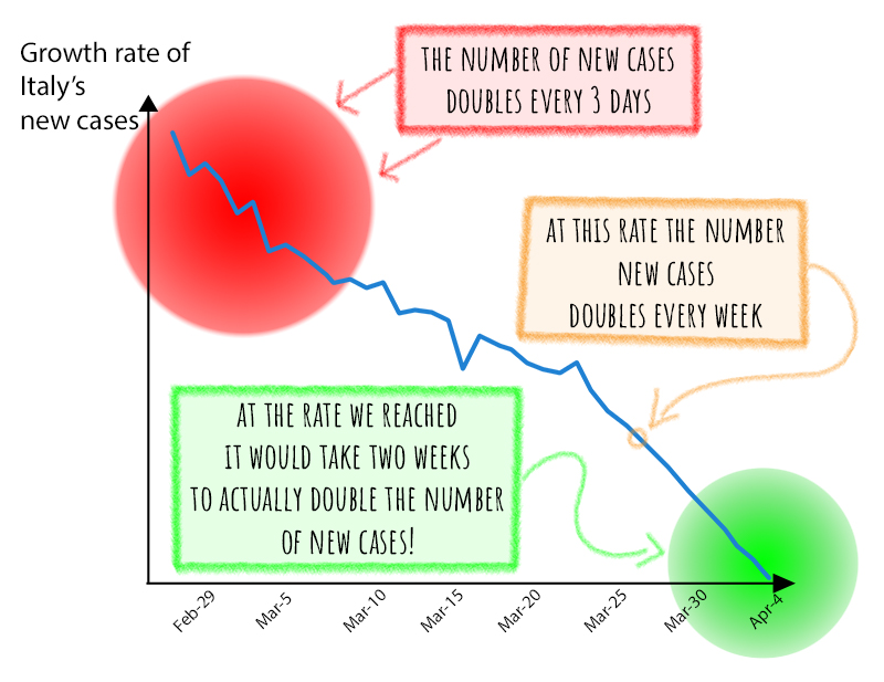
The results look like this:
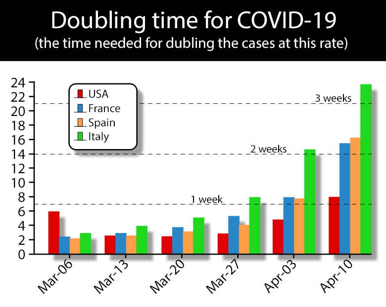
Or this:
If you like the idea feel free to re-use the images or apply the doubling to your graphs!